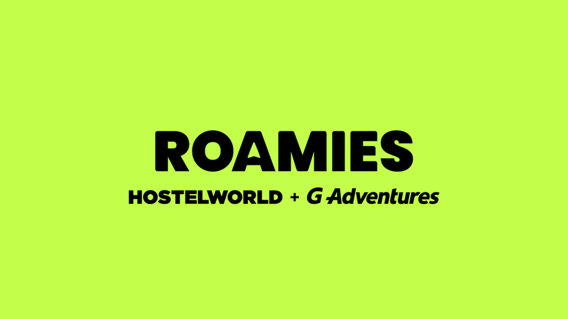
The challenge? Building a brand that felt at home with both G Adventures’ community of experience-seekers and Hostelworld’s global network of social travellers, while standing apart from both. The solution wasn’t just a product - it was a new way to travel, built for a generation that craves both adventure and ease.
The Arrows
When we started this journey together, we looked deep into G Adventures logo and sensed there was something, ya know, familiar. Apart from claiming the literal best travel words on the planet, ‘world’ + ‘adventure’, we found a visual connection, a symbol that united both brands.
Arrows evoke action and give direction. They connect people and places, and people with places. They connected them.
I wanted to carry that essence of movement and connection into Roamies.

The primary colour palette is vibrant like neon lights on fun-filled nights!
It’s no coincidence (it’s definitely a coincidence but it works) that this colour palette aligns pretty nicely with those highlighter pens that we use to mark all THE best things. Or Post-It Notes we scribble our life-changing plans on.
Travel is one big adventure, full of zest and life and all things bright. It’s rarely polished, well not their style of travel anyway, and these colours reflect the energy Hostelworld and G Adventures share in turning ideas into life-affirming experiences.
Launch Video
Want to check what's live?
Click here.
Click here.